Culture June 22, 2017
Can you believe it's been around since 1998?


Google is one enterprise that has changed their logo more than once.
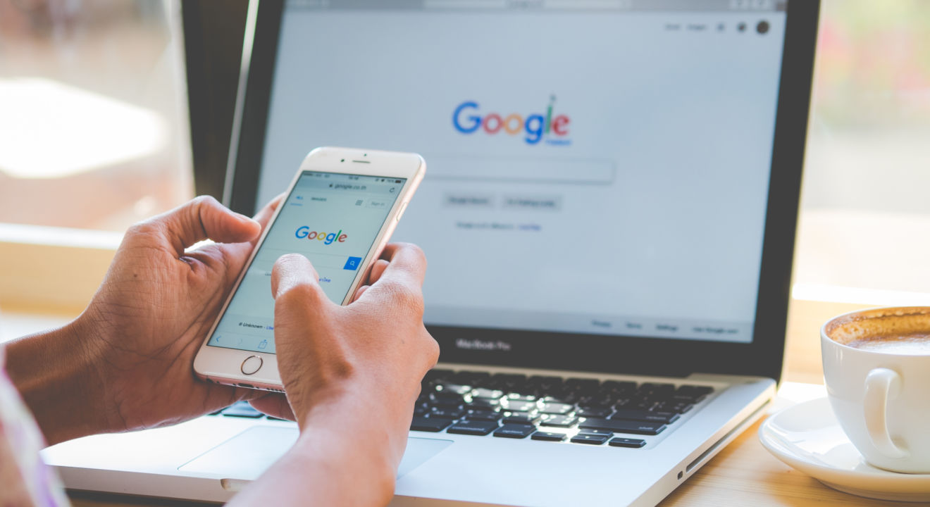
While Google has evolved in many different ways, the Google logo has always been the same, yet different. Since the beginning of Google, they have continued to stay faithful to the original design, but have switched colors around and changed fonts throughout the years.
The Google 1998 logo was the original, consisting of the same colors as it has now, with the only difference being the old one was more bubble-lettered compared to the flat Google logo today.
One of the co-founders of Google, Sergey Brin, created the Google 1998 logo using a free graphics program called GIMP. This logo was only used for two months until they added an exclamation point to mimic “Yahoo!.”
This new logo had an exclamation point, rounder letters, shadows formed from each letter and switched the color of the “G” from green to blue. This new color sequence is the same as the one we use today, but of course there is no more exclamation point and the font is slightly different.
Brin and Page, the founders of Google attended the Burning Man Festival and incorporated a stick figure of a man in the logo, starting the Google Doodle.
If you think back to a time you were searching something on Google and the Google logo wasn’t the usual red, green, blue and yellow letters, but was instead “Google” written in a fun design, this is a Google doodle.
This was first used to tell people that the founders were out of the office, but now it is used to celebrate special holidays. The founders hired Dennis Hwang as an intern to design all of the doodles and ended up giving him a permanent job where to this day, he continues to make the Google Doodles.
From 1999 to about 2010, the logo looked skinnier and had different accent colors making this logo prettier than the Google 1998 logo. In 2010, the logo was brighter with less shadows making the logo look cleaner.
Keeping that logo for three years they finally changed it to the logo that we have seen for the past two years. This logo is the one most of us are used to and had no shadows making it look flat. The Google logo today is without serifs. It is still flat, but the letters are more round.
Check this out, if you type in “Google in 1998” it will show you exactly what Google looked like in 1998. Google is definitely not a stranger to making alterations to their logo, but they have always kept the original concept.
It gives me this sense of comfort knowing that it is okay to constantly be changing as long as you don’t forget where you come from. Google is the number one website in the world and it’s not because their logo is constantly changing, but because of what Brin and Page did for the modern world.