Culture April 4, 2017


In less than two decades, the Google logo has become one of the most recognizable logos worldwide. But what did it take to get to the colorful image we now know and love?
If you’re curious about the Google logo history, look no further because ENTITY has you covered.
Here are five things you should know about the changes made to the logo.
The first logo was used for Brin and Page’s Stanford University graduate project. For this design, the exclamation mark was added to mimic the Yahoo logo.
Then when Google launched in September 1998, this same logo was used, but the word “beta” was written underneath.
The first Google doodle was essentially created as an out-of-office message. Brin and Page designed this Burning Man Google logo to notify users of their absence in case servers crashed.
But now, the Google logo often changes in order to celebrate national holidays, famous birthdays and memorable historical events.
For the new and improved logo, Kedar, Brin and Page removed the exclamation point and used a different font. Their goal was to keep the logo simple, recognizable and playful. The Catull typeface was meant to create a more sophisticated look, but the colors are what kept the logo fun.
The logo went through various designs before arriving on the typeface and color scheme it has today. “There were a lot of different color iterations,” Kedar told Wired. “We ended up with the primary colors, but instead of having the pattern go in order, we put a secondary color on the L, which brought back the idea that Google doesn’t follow the rules.”
Come 2013, the Google logo went through a couple more typographical tweaks. This time, the team decided to make the logo brighter by creating a flat look and removing the original drop shadow.
In September 2015, Google decided to change things up once again by creating a logo that was part of a family. This new logo is meant to reflect the way users interact with Google products across different platforms.
“As you’ll see, we’ve taken the Google logo and branding, which were originally built for a single desktop browser page, and updated them for a world of seamless computing across an endless number of devices and different kinds of inputs,” Google wrote to explain the update.
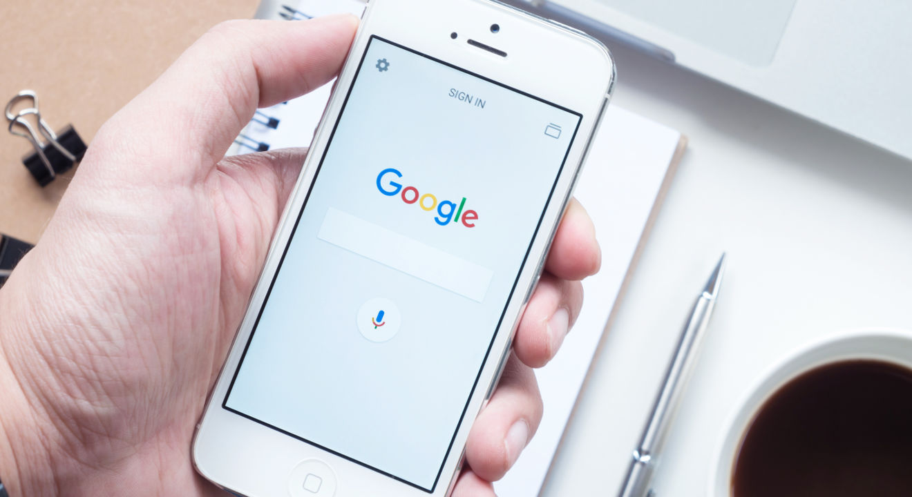
So now, the “G” icon, which can be seen on smartphone and tablet applications, is a four-color G meant to match the desktop logo.
And as Google continues to improve its services, you can probably expect more changes to the logo. But until then, at least you’re caught up with the Google logo history.