

Recent Posts
Culture June 23, 2017
And the winner for Most Changed is...
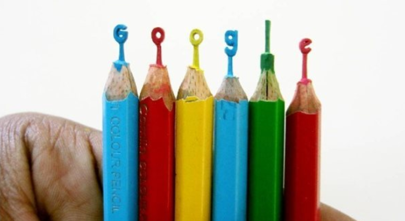 Photo by Google via Instagram
For younger internet users, it may be to imagine how the Google logo has changed through the years.
Maybe you’ve never even thought about it. But for the more observant Google users, the logo is an ever-changing organism.
The Google logo wasn’t an easy task to come up with.
The company admits that they took a long time to come up with a name. Little did they know that their own business name would one day become a verb in the dictionary. Not only that, but we’re sure they never imagined what they would be capable of creating with the Google Doodle.
So if you’ve been wondering how all of this started, ENTITY’s got you covered.
It was very simple. The Google logo was spelled with toddler-like block letters that were slightly tilted on their side and multi-colored. Each block was colored with shades of yellows, blues, reds or greens. What might surprise some is that the same signature colors have been used from the very beginning.
Building on from the baby block letters, the second version looks much cleaner. Created in the same year as the first, the words are no longer tilted and are more defined. This version stuck around much longer than the first. The next notable difference happened in 2001 according to TIME.
With some minor rearrangements in the colors of the letters, the logo remained almost exactly the same. It’s been rumored that adding the explanation point played a part in making “Google” a verb in the dictionary. Or, perhaps they did it to compete with Yahoo?
Or, perhaps they did it to compete with Yahoo?
Next on the list, the 2003 logo. The explanation point was dropped, and the logo looked much sleeker. The letters are much narrower than the original block cut-outs, and there’s still a slight shadow. For the remainder of the early 2000s, the Google logo appeared very similar in style. Not changing much from this clean and chic style.
And we can’t forget the Google Doodles.
The first Google Doodle was sent to the company from a user in 1998. According to the Atlantic, it was a burning man stick figure. Google reports that by 2014, they had published over 2,000 regional and international Doodles. The Doodles feature guest artists, musicians and personalities.
Google Doodles are drawn for just about anything. There are Doodles about celebrities’ birthdays, about famous discoveries, about international and national holidays, scientists’ birthdays and generally memorable moments in history.
They are informative and give users a chance to learn about something they might not have expected. When users click on the Doodle they get redirected to a page with information about the famous person, historical event, or discovery being featured.
Like anything worthwhile, the Google logo is constantly being tweaked with and improved upon. It’s an ever-evolving design with a life of its own.